WIR BANK SWITZERLAND
WIR BANK SWITZERLAND
The ap-pearance of an unusual bank.
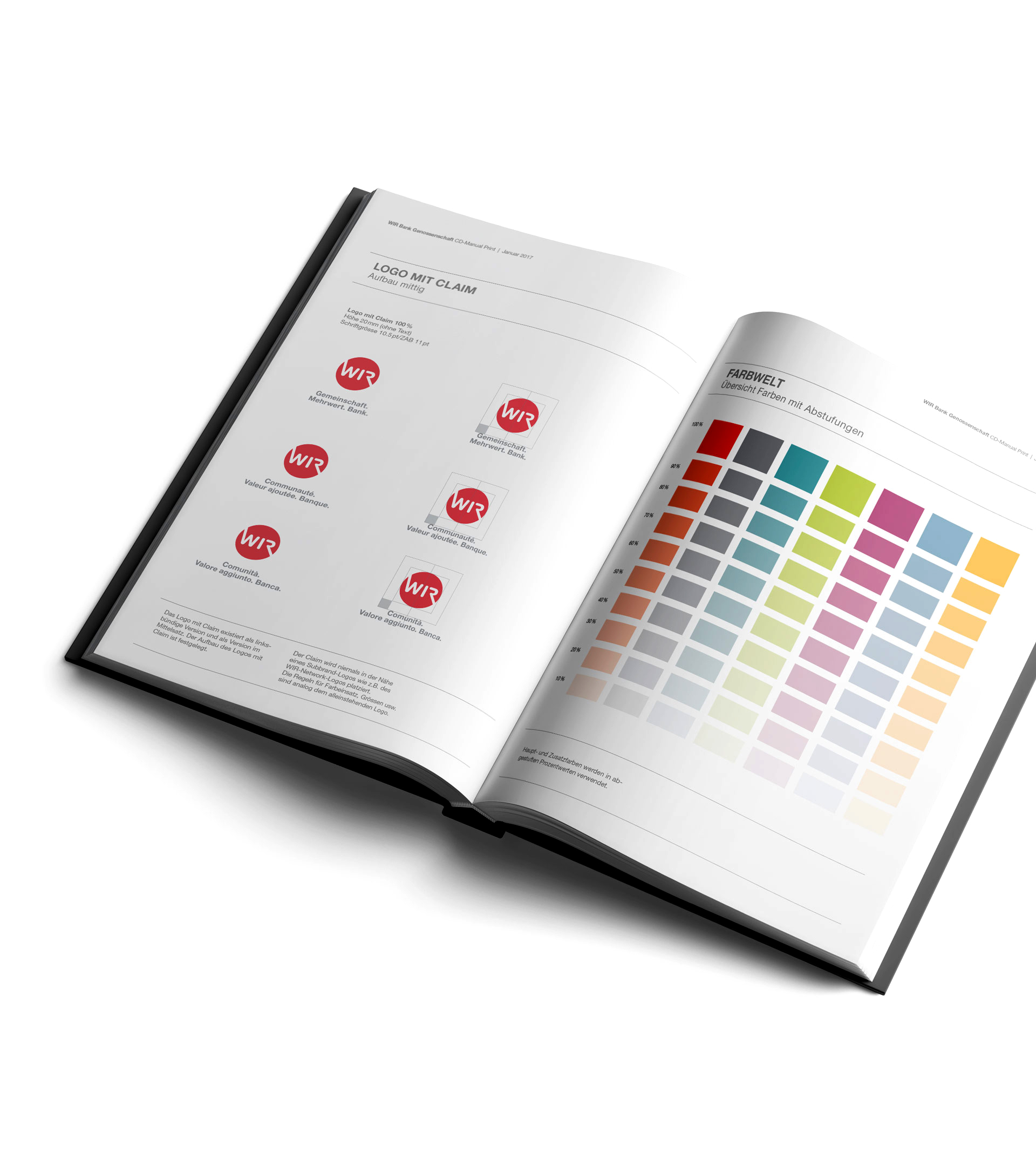
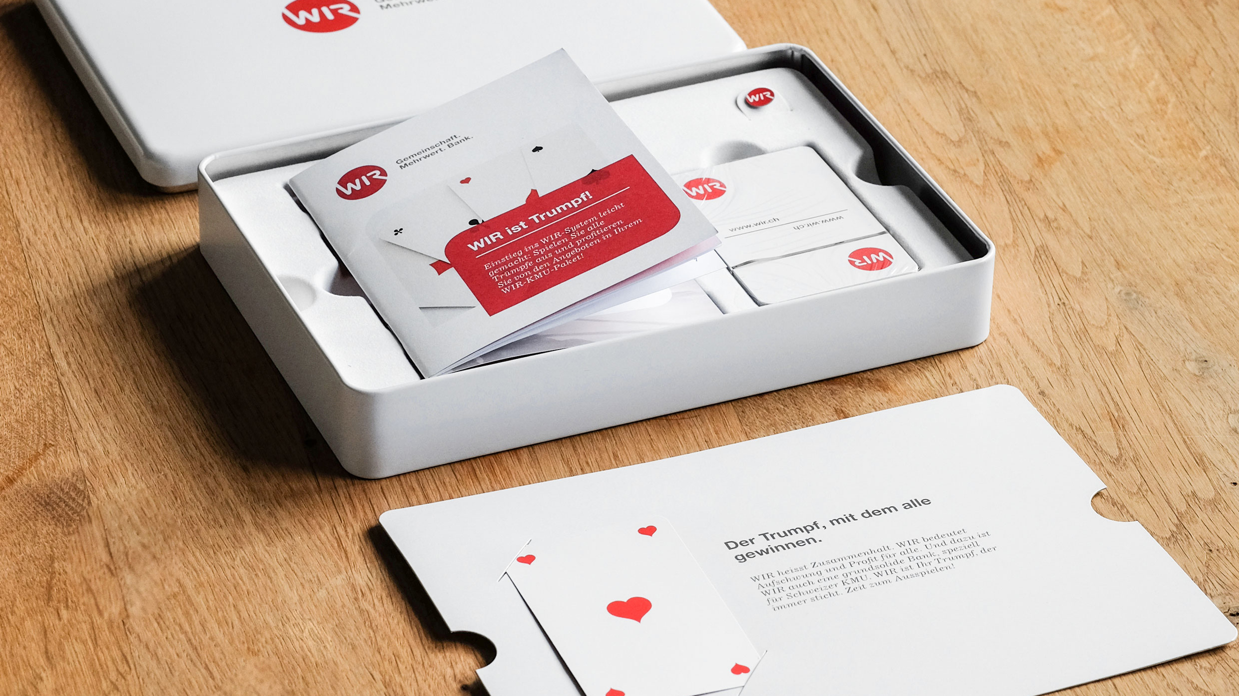
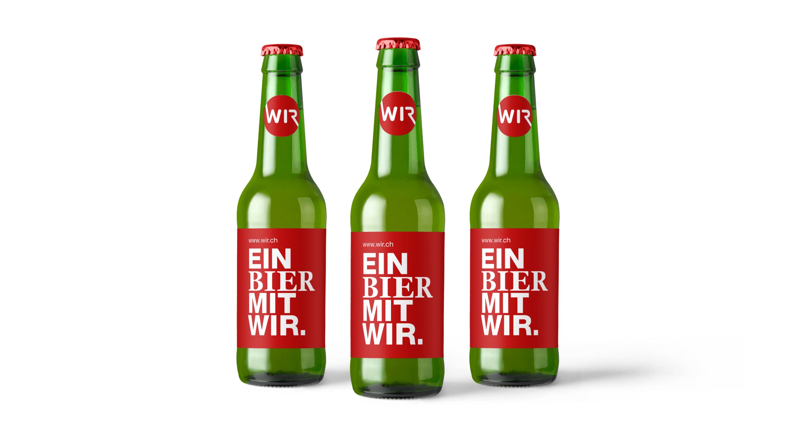
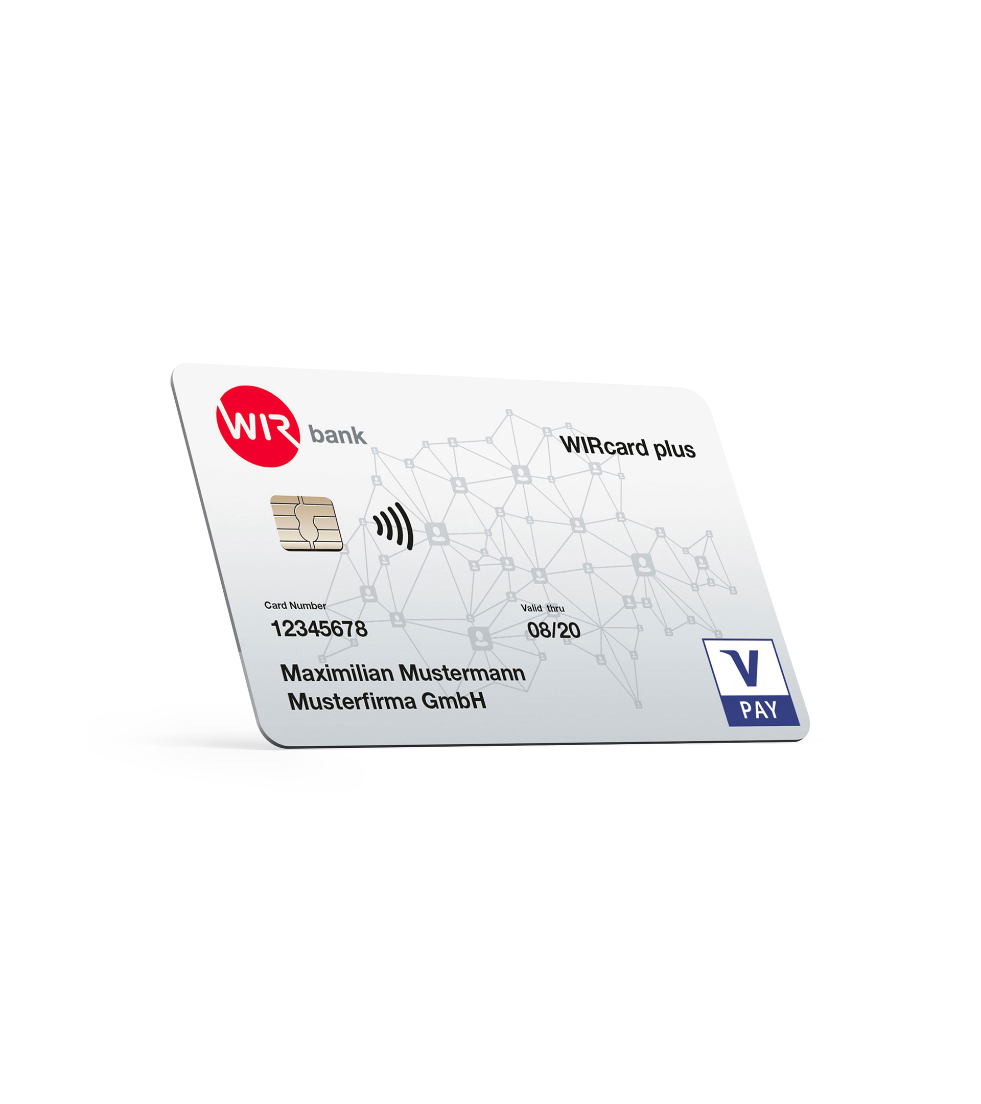
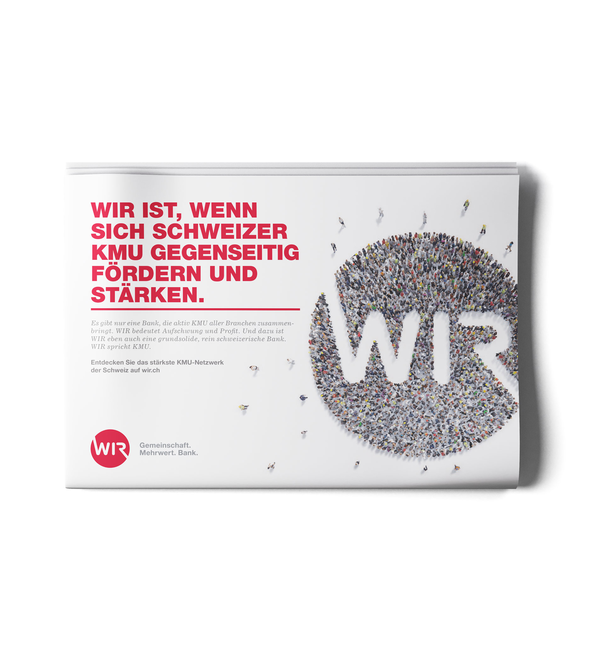
Who says the financial world always has to be dry? Especially not when it comes to a bank that focuses on Switzerland and SMEs. For WIR Bank Genossenschaft, we designed a completely different banking experience from the boring competition. Our approach was based on the back-to-the-roots philosophy. From the first logo (1934), which was also already round, to the Swiss color palette and unconventional wording. We chose each element carefully to really emphasize the identity and character of the bank.
Skills:
- Strategy
- Market Research
- Corporate Design
- Art Direction
Challenge:
Many banks tick in the same way. It was exciting to design a unique language, but one that also embodies a solid and trustworthy partner.
Visit:
Largest Relaunch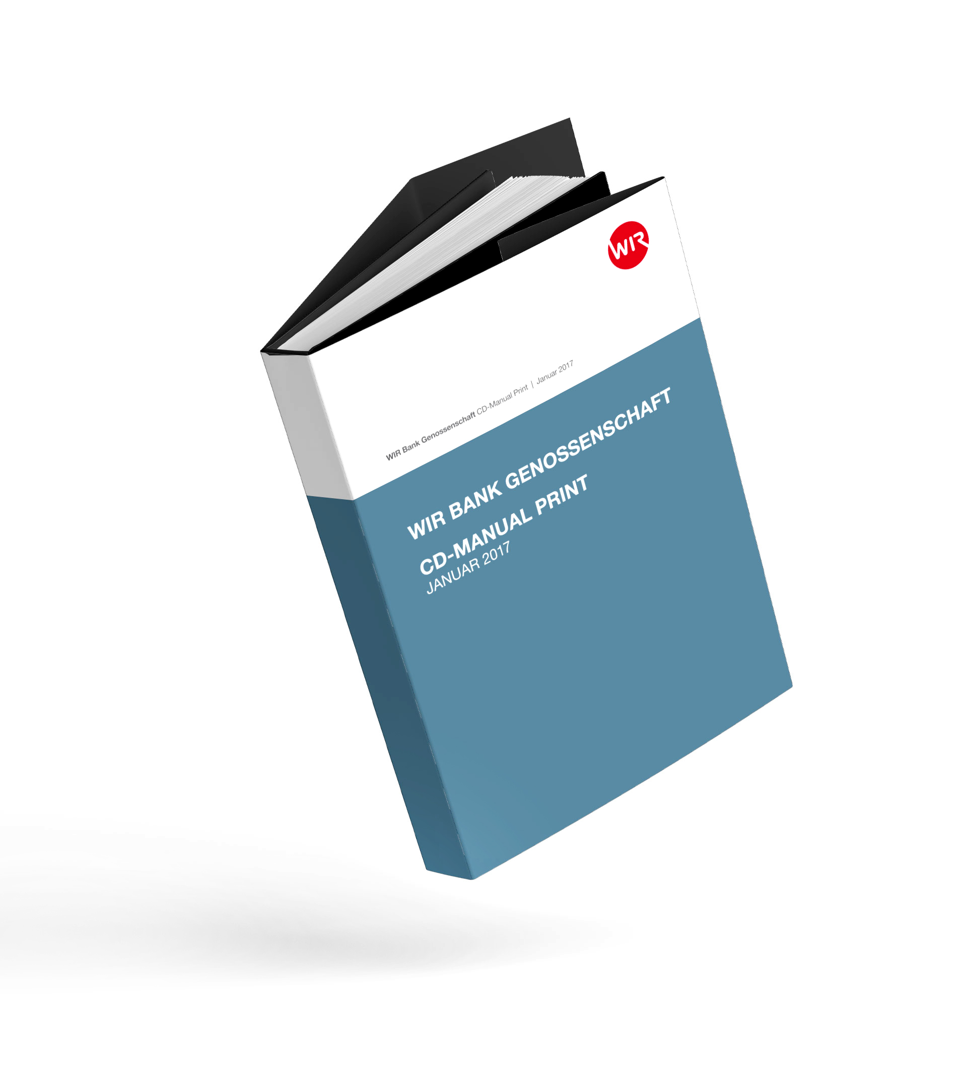

What we offer
is diverse.
Admittedly, we are quite good at talking. But we are even better at implementing. Therefore, we would like to not only tell you what we can do for you, but much rather show you. With a selection of our heart projects.